Newton Colonial Home Interior Design :: Traditional meets modern family living
Before & After
Today I want to share a beautiful Before & After with you all! You may recognize some of these photos as the project was just featured in Sunday’s edition of the Boston Globe Magazine {or online here}. I have to admit I will never stop getting that “pinch me” feeling when I see our work in print! I wanted to share a little bit more about the project and how it all came together so read on for the juicy details…
This young family immediately fell in love with this beautiful old colonial home {built in 1900} in Newton. When they moved in, they brought with them a hodgepodge of family furniture that they had collected over the years. So while their house was fully furnished, it didn’t reflect their style or feel like home to them.
They approached KMID to help them marry their youthful spirit with both the house and the classic pieces that they had inherited. We wanted to honor the bones of the home and its history, but also make it work for the homeowners and withstand the rigors of family life. To achieve this, we kept a lot of their antique furniture, and reupholstered it with more updated, fresh fabrics. This helped keep the traditional lines and curves, but with a more updated and fresh take. It’s a very beautiful traditional home, and the aesthetic embraces the history but also feels welcoming and casual.
When these new home owners moved in, they wanted to highlight the thick original moldings and lovely wainscoting in the living room and entry. They started by painting the trim a cooler and brighter white to really highlight the intricate woodwork in the entryway. We then chose this gorgeous wallpaper from The Martin Group to make an impact and really set the tone for the rest of the home. The fun 1950’s Spanish metal light fixture from English Accent Antiques helps strike the perfect balance between modern and traditional.
This corner is in the living room, and we wanted to make sure it didn’t get lost in the space. This painting by Elise Morris from Jules Place packs some color and texture and draws the eye to this special nook. This “Samuel” wingback chair from Furnishings by Design grounds the corner of the room and balances the other furniture in the room. The clean and fresh white drapes and sweet blue and white floral window seat cushion make for a bright and relaxing reading nook.
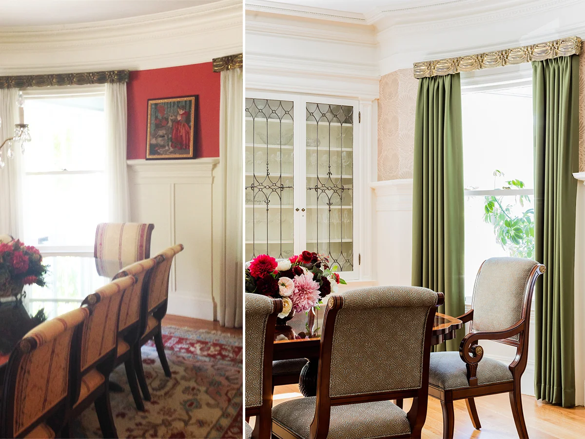
Once again, the bones of this room were beautiful. We replaced the red paint with a beautiful printed grasscloth by Berkeley House that immediately brightened and transformed the room. We loved the curves and shape of their existing dining room chairs, but reupholstered them with a metallic Nina Campbell fabric to give them an updated look. As for the window treatments, the vintage metal valances were a really cool and unique element that we wanted to keep. We replaced their existing white drapes with these beautiful green wool window treatments by Brunschwig & Fils, adding some color and luxury to the space.
For more photos from this project shot by Michael J. Lee Photography check out Newton Colonial on the Portfolio section of our website or check out our Pinterestpage. You can also read about the project in this Sunday’s edition of the Globe magazine {or online here}.
Design is everywhere. Be inspired.


